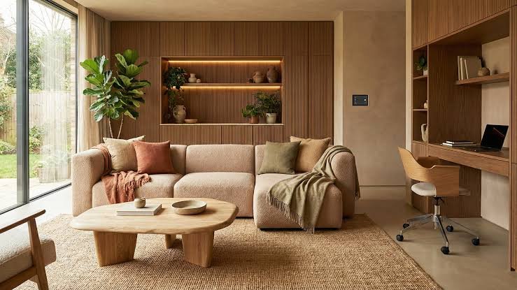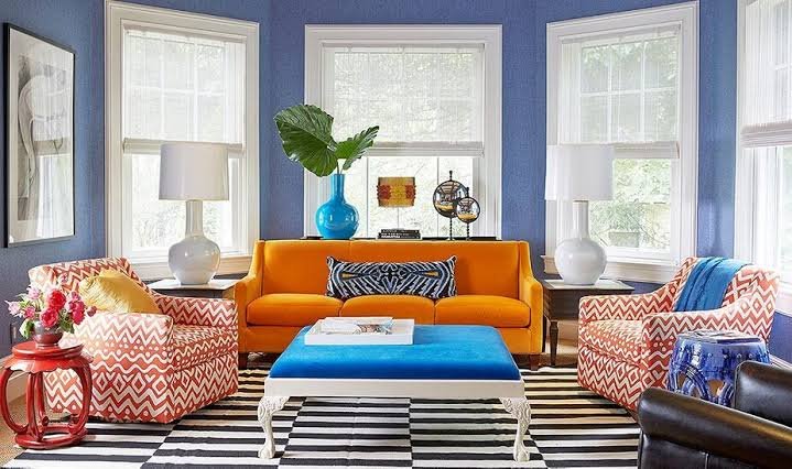
You’re standing in a paint shop with forty shade cards in your hand, and none of them look the way they did on Pinterest. Sound familiar? Figuring out how to choose color palette for home interiors trips up more people than almost any other decorating decision — because colour is personal, but it’s also technical, and most of us are guessing at both at once. In 2026, with so many finish options and undertones to pick from, it’s easy to freeze up. This guide walks through it properly, room by room, so you’re not repainting your living room three times before you get it right.
Start With How the Room Is Used, Not the Colour You Like
This might be the single most common mistake I see. People pick a colour they love in isolation — a gorgeous deep teal, say — and then try to force it into a room where it just doesn’t work.
Quick answer: When you’re figuring out how to choose color palette for home spaces, start with the room’s function first — bedrooms benefit from calming, muted tones, while kitchens and living rooms can handle more energy and contrast, since they’re used differently throughout the day.
A bedroom that gets used mainly at night doesn’t need a bright, energetic colour. A kitchen where the whole family gathers can take a bit more boldness without feeling overwhelming.
Ask yourself:
- What time of day is this room mostly used?
- Is it a space for relaxing, or for activity and conversation?
- Do multiple people share it, with different tastes?
Understand Undertones Before You Fall in Love With a Shade
Here’s something that trips up even people who think they know colour — undertones. Two whites can look identical on a swatch card and completely different on a wall.
I once helped a friend in Jaipur pick “warm white” for her hallway, and under her tube lighting it read distinctly yellow-green. Not what either of us expected. Lesson learned: always test paint on the actual wall, under the actual lighting, before committing.
To check undertones properly:
- Buy a small sample pot (most Indian paint brands sell these for ₹150-300)
- Paint a patch on at least two different walls in the room
- Look at it in the morning, afternoon, and evening — natural light shifts undertones dramatically
- Compare it against white paper, not just by eye
Don’t skip this step. It’s the difference between a colour that reads as “warm and cosy” versus one that just looks off.
The 60-30-10 Rule Still Works (Use It as a Starting Point)
Every colour palette for home guide mentions this rule, and honestly, it’s a cliché for a reason — it works.
Quick answer: The 60-30-10 rule means 60% of the room in a dominant colour (walls, large furniture), 30% in a secondary colour (curtains, rugs, accent furniture), and 10% in an accent colour (cushions, art, decor pieces) — giving the room balance without feeling chaotic or flat.
That said, I’d argue it’s a starting frame, not a rigid law. Some of the most interesting rooms I’ve seen bend the ratio slightly — maybe 50-35-15 — once you’ve got a feel for what looks right in your specific space.
Warm vs Cool Palettes — Which Suits Indian Homes Better?
There’s no universal answer here, honestly, and anyone who tells you there is hasn’t seen enough different homes.
Warm palettes — terracotta, mustard, warm beige — tend to suit north-facing rooms that don’t get much direct sun, since they add visual warmth the natural light doesn’t provide. Cool palettes — sage green, dusty blue, soft grey — work well in south-facing rooms that already get strong, bright sunlight, balancing that intensity out.
Picture a south-facing living room in Ahmedabad that gets harsh afternoon sun for hours. A cool sage or blue-grey palette softens that glare considerably. Flip it to a dim, north-facing bedroom in the same flat, and a warm off-white or soft terracotta makes the room feel far less cold and clinical.
How to Choose a Color Palette for Home Interiors Room by Room
Different rooms genuinely need different approaches, so treating your whole house as one single palette decision usually backfires.
Living Room
This is the room guests see first, so it carries the most weight in setting your home’s overall tone. Neutral bases (greige, warm white, soft taupe) with one bold accent wall tend to age well and don’t limit your furniture choices later.
Bedroom
Muted, low-saturation colours work best here — dusty blues, soft sage, warm greys. Bright, high-energy colours (think saturated orange or red) can actually interfere with sleep quality, according to several sleep-focused design studies.
Kitchen
Kitchens can take more personality. Warm yellows, deep greens, even navy lower cabinets paired with lighter upper units are having a real moment right now.
[link to related guide about small kitchen decorating ideas here]
Testing Your Palette Before You Commit
Don’t trust a screen. I really can’t say this enough.
Paint colours look wildly different on a phone screen versus an actual wall, and even more different depending on your wall’s texture and the direction it faces. Buy sample pots. Paint A3-sized patches, not tiny 2-inch swatches — you need enough surface to actually judge the colour properly.
- Test at least 3 shortlisted colours side by side on the same wall
- Live with the samples for 2-3 days minimum before deciding
- Check them under your actual light bulbs, not daylight alone, especially if you use warm-white LEDs at home
Building a Palette Around Existing Furniture or Flooring
Most of us aren’t starting from a completely blank slate. You’ve probably already got a sofa, a bed frame, maybe flooring you can’t change right away.
[link to related guide about vinyl plank vs laminate flooring here]
In that case, work backwards. Pull the dominant and secondary colours from your existing furniture or flooring, then build your wall colour and accents around those, rather than picking a wall shade first and hoping everything else matches.
Common Color Palette Mistakes to Avoid
A few things I see go wrong again and again:
- Choosing every wall colour separately, room by room, with zero connecting thread through the house
- Going too matchy — every accessory in the exact same shade, which reads flat and a bit lifeless
- Ignoring the ceiling — a stark white ceiling against warm walls can look jarring; consider a soft off-white instead
- Skipping the sample-testing step entirely (this one’s the biggest culprit, in my experience)
[link to related guide about decorating on a budget here]
FAQ: Choosing a Color Palette for Your Home
Q: How many colours should I use in one room? Stick to 3 main colours per room, following something close to the 60-30-10 split. More than that and rooms start to feel busy rather than intentional.
Q: What’s the best color palette for a small home? Lighter, more muted tones generally work better in small spaces — they don’t visually shrink the room the way darker, saturated colours can. That said, one darker accent wall can actually add depth rather than closing a room in.
Q: Should my whole house have one consistent color palette? Not necessarily identical, but there should be some connecting thread — a shared undertone or one repeated accent colour — so the house feels cohesive as you move between rooms.
Q: How do I choose a color palette if I have colourful furniture already? Pull 2-3 dominant shades from the furniture itself and build your wall and accent colours around those instead of picking new colours independently.
Q: Do dark colours make a room feel smaller? Not always — it depends on lighting and how the colour is used. A dark accent wall with good lighting can actually add cosiness and depth rather than shrinking the space.
Q: What color palette is trending for Indian homes in 2026? Warm neutrals paired with one saturated accent colour — think terracotta, deep green, or mustard — is the dominant trend, moving away from the stark all-white and all-grey palettes of a few years back.
Final Thoughts
Getting your home color palette right isn’t really about finding the “correct” answer — there isn’t one. It’s about matching colour to how you actually live in each room, testing properly before you commit, and giving yourself permission to bend the rules once you understand them. Grab a few sample pots this weekend, paint some real patches on your walls, and live with them for a few days before you decide anything. That patience is what separates a palette you love a year from now from one you’re already regretting by the second coat.